Will Parker Rebrand
A collection of assets created for Will Parker’s band rebrand.
The message behind to design
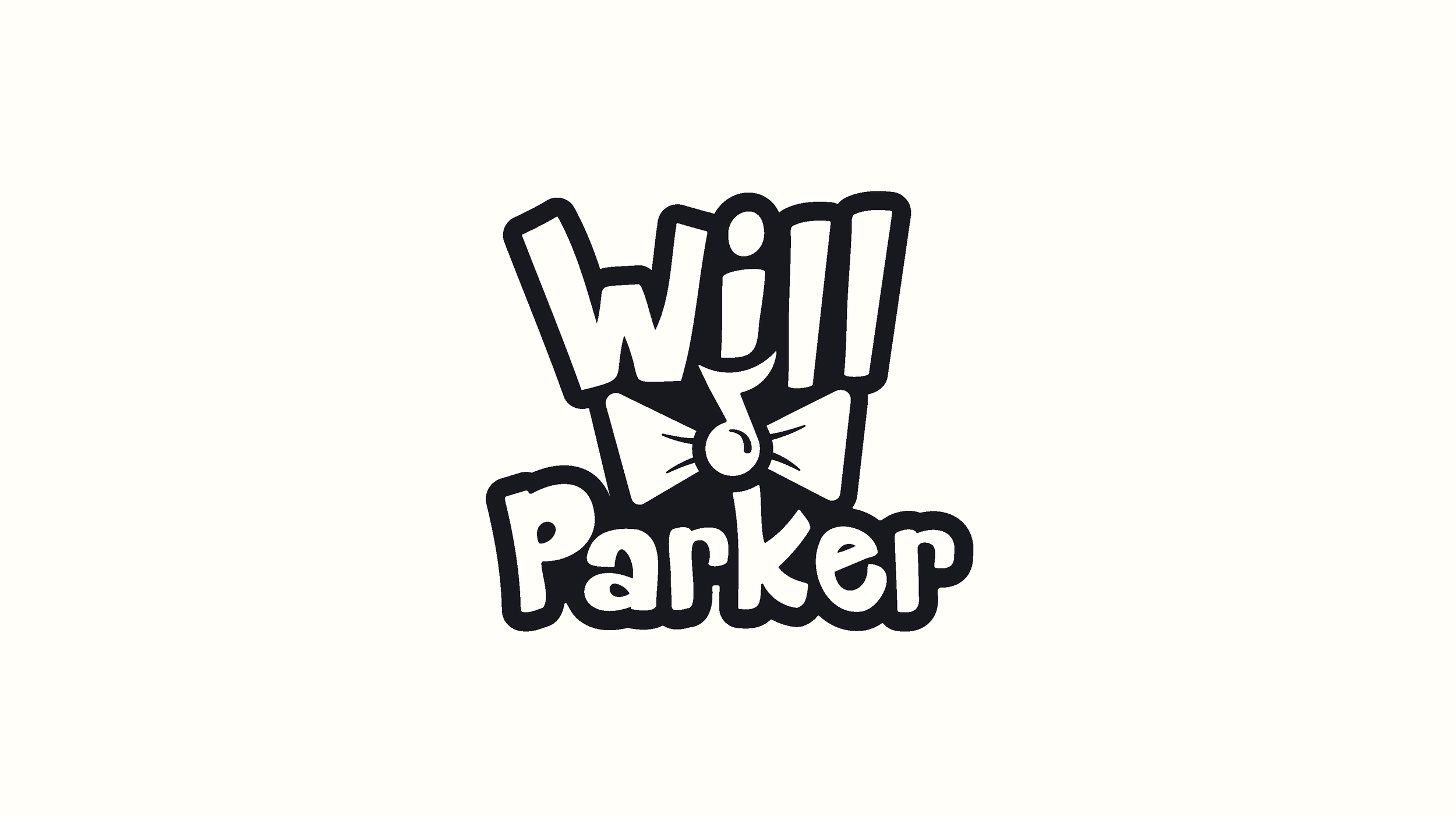
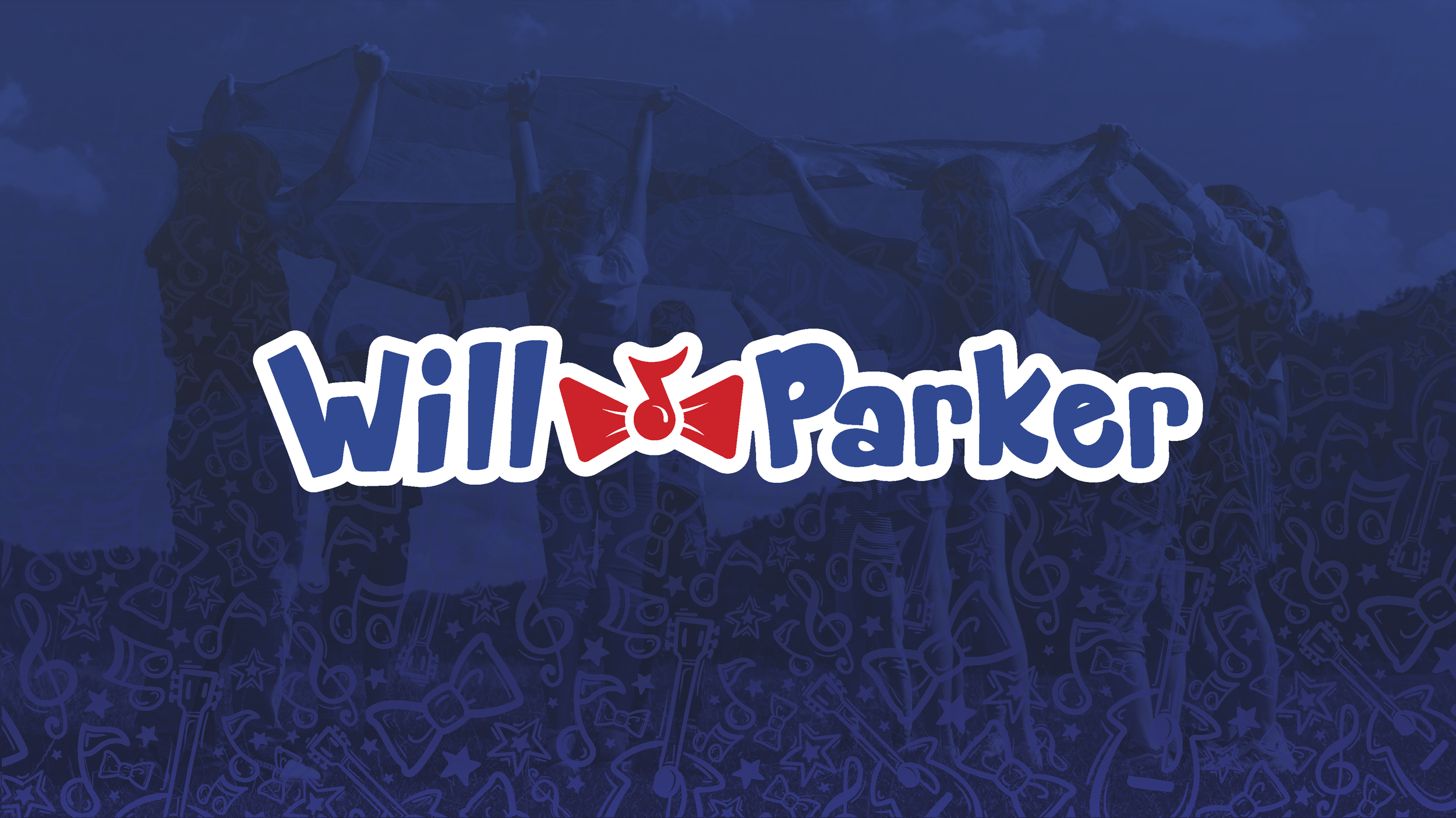
Will Parker’s rebrand was all about letting the joy of music shine through every aspect of the brand. We wanted to create a logomark that didn’t take itself too seriously but could still function in any business setting. The letterforms were created to feel hand drawn and bold.
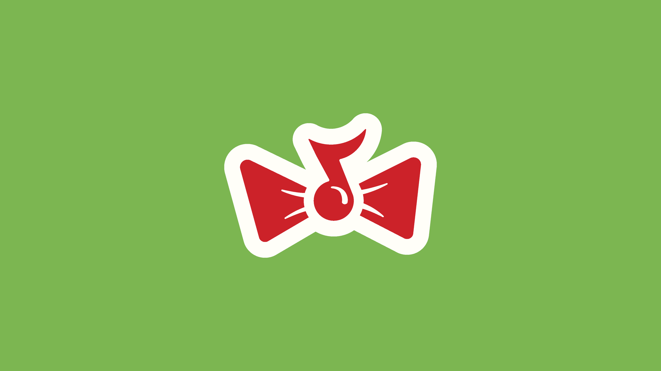
The music note bowtie was designed to connect the viewer to what the brand stands for while reflecting Will’s trademark bowtie outfit he wears whenever performing.
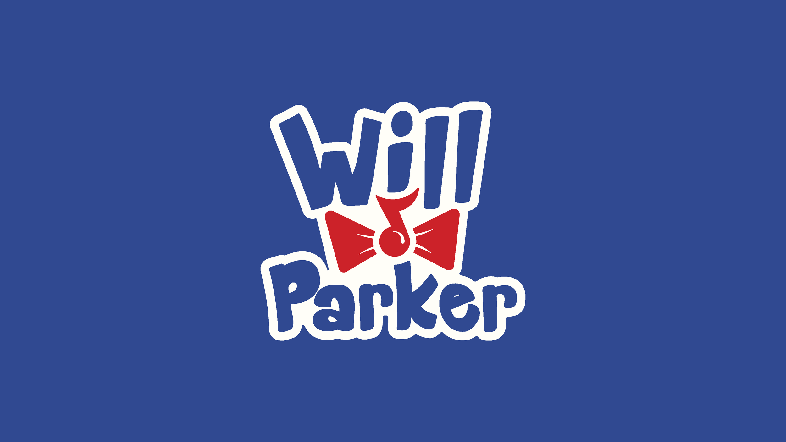
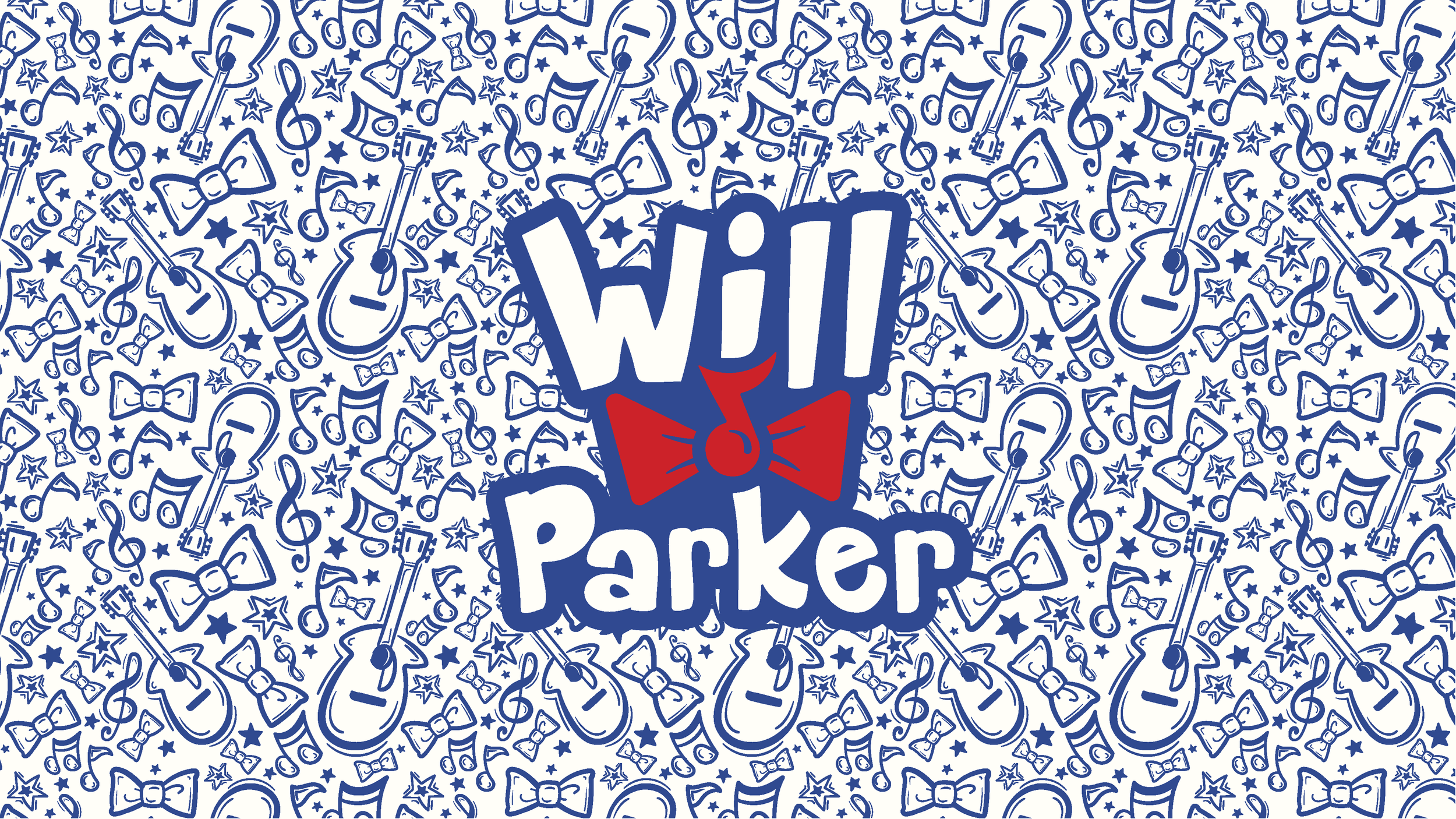
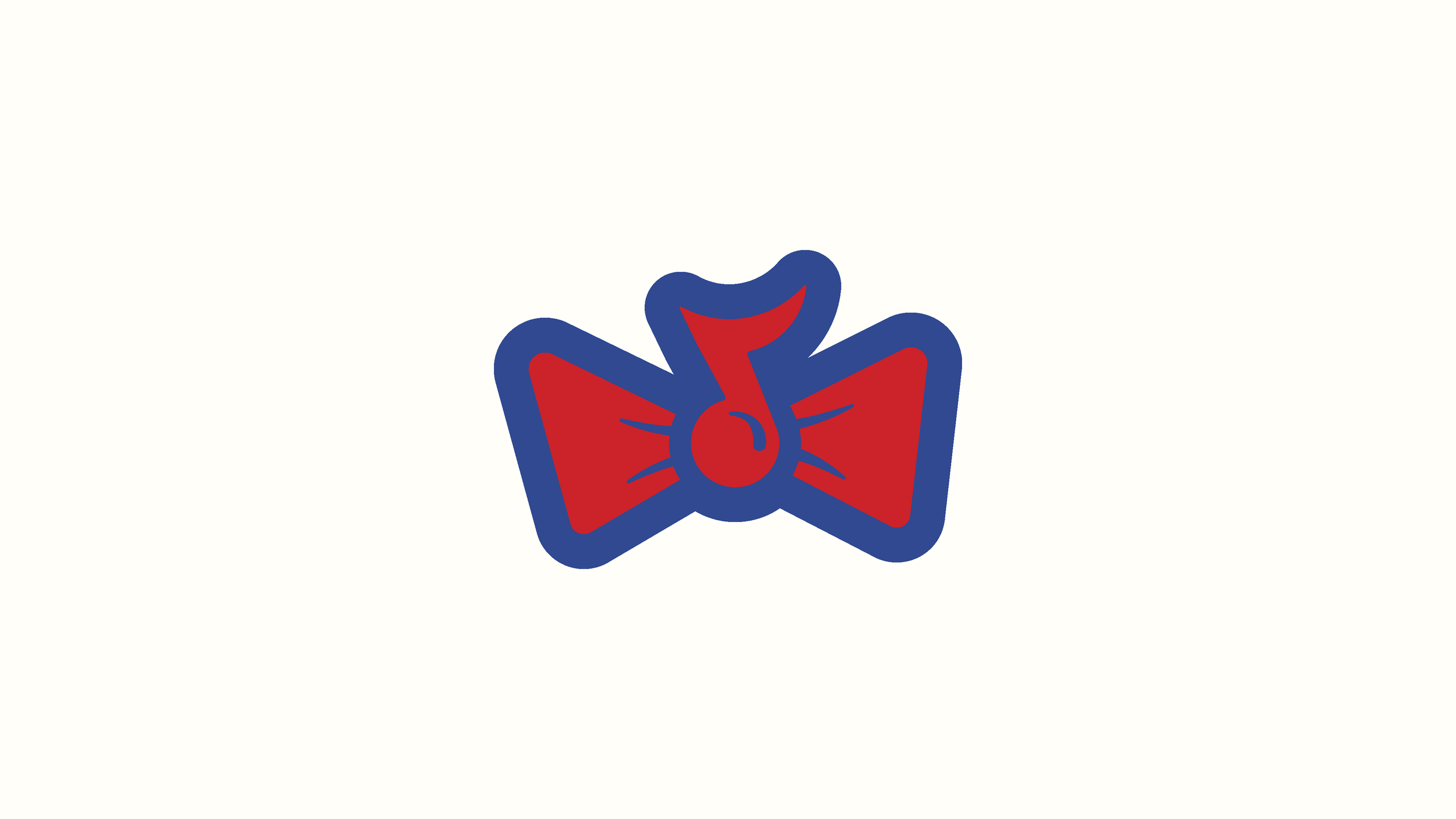
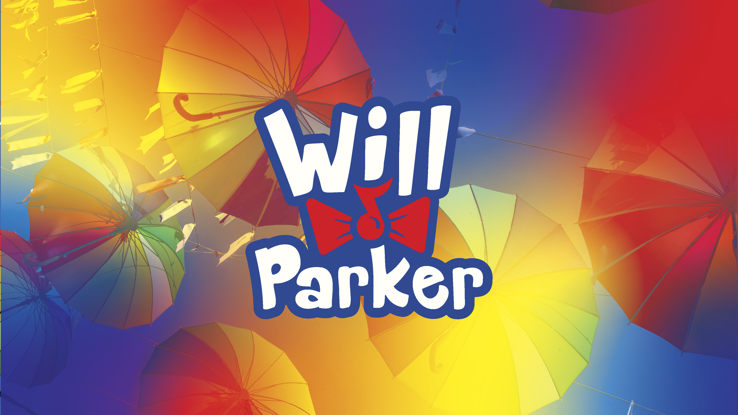
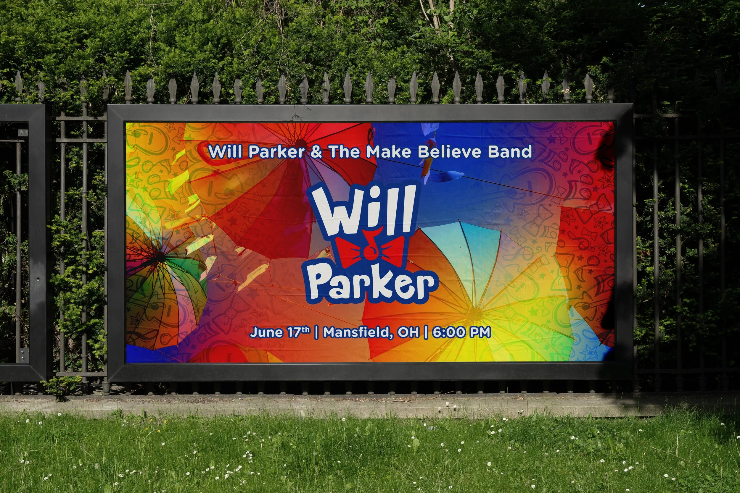
We designed this brand to pop. The design of the logomark and icon needed to be bold and playful with patterns and color choices that would compliment the bands whimsical, wild style.
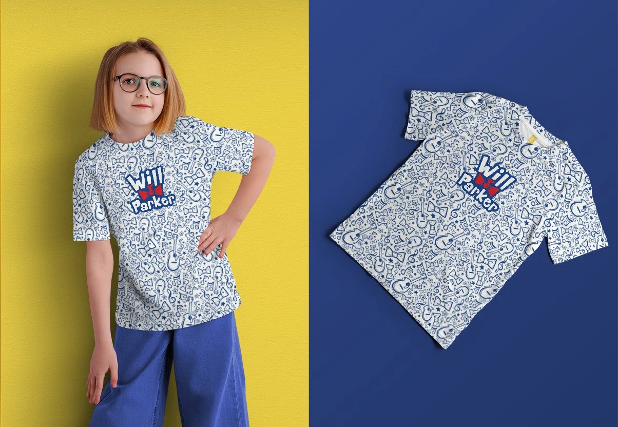
We expect the brand to be showcased in both small and larger formats like album covers or stickers to large event signage for stage or advertising.
The logo Suite
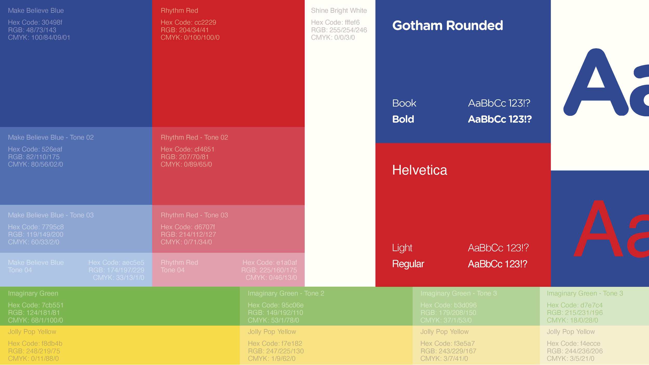
Color, typography and Patterns
Gotham Rounded strikes a balance between a professional and playful typeface and felt right at home within Will’s brand. The rounded edges give the brand a bouncy, balloon like feel that is perfect for a children’s music band. We paired this with a classic, tested secondary typeface, Helvetica. Helvetica gives the brand a grounded presents that helps it feel fun and playful while also professional.
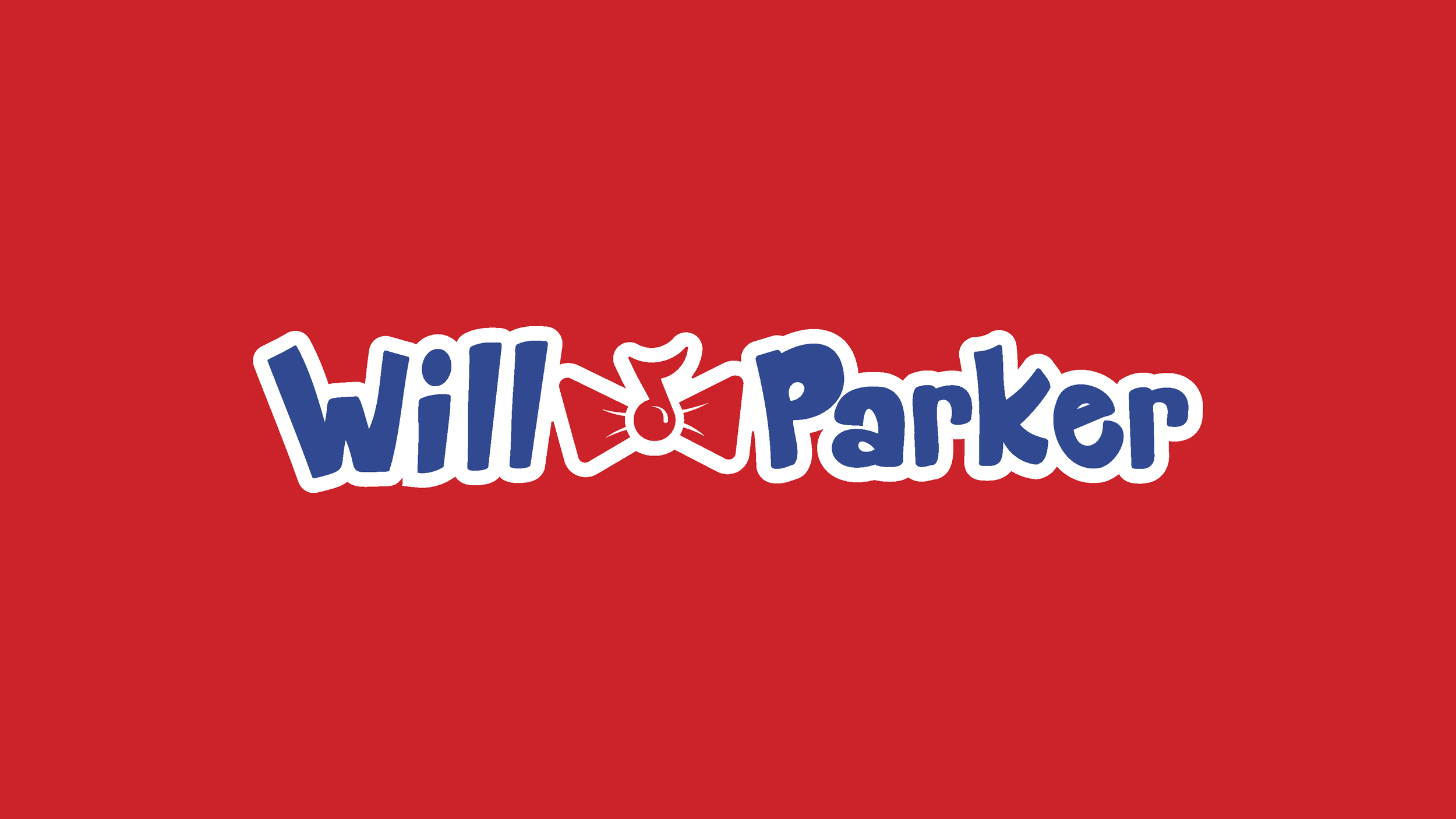
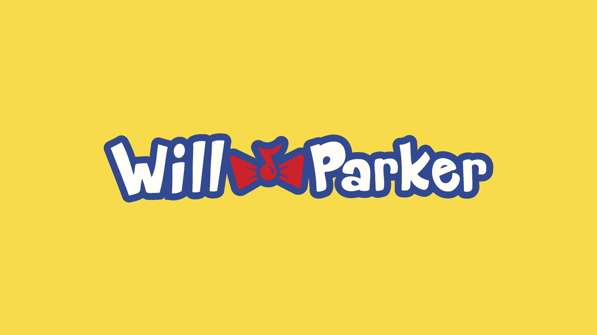
If you remember you early school years then you’ll be familiar with the brand colors we chose here. We went to a selection of primary colors of red, blue, and yellow with a secondary green that felt right at home with the primes. This immediately pulls the brand into a youthful space without feeling too juvenile.
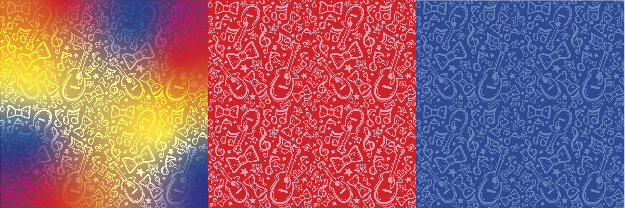
Patterns are hand-drawn and inspired by the bands aesthetic. We added a wide variety of color combinations including a tie-dye inspired gradient pattern that feels oh so summer camp inspired.