Oracle Group Branding Suite
A collection of assets created for the real estate organization Oracle Group.
The message behind to design
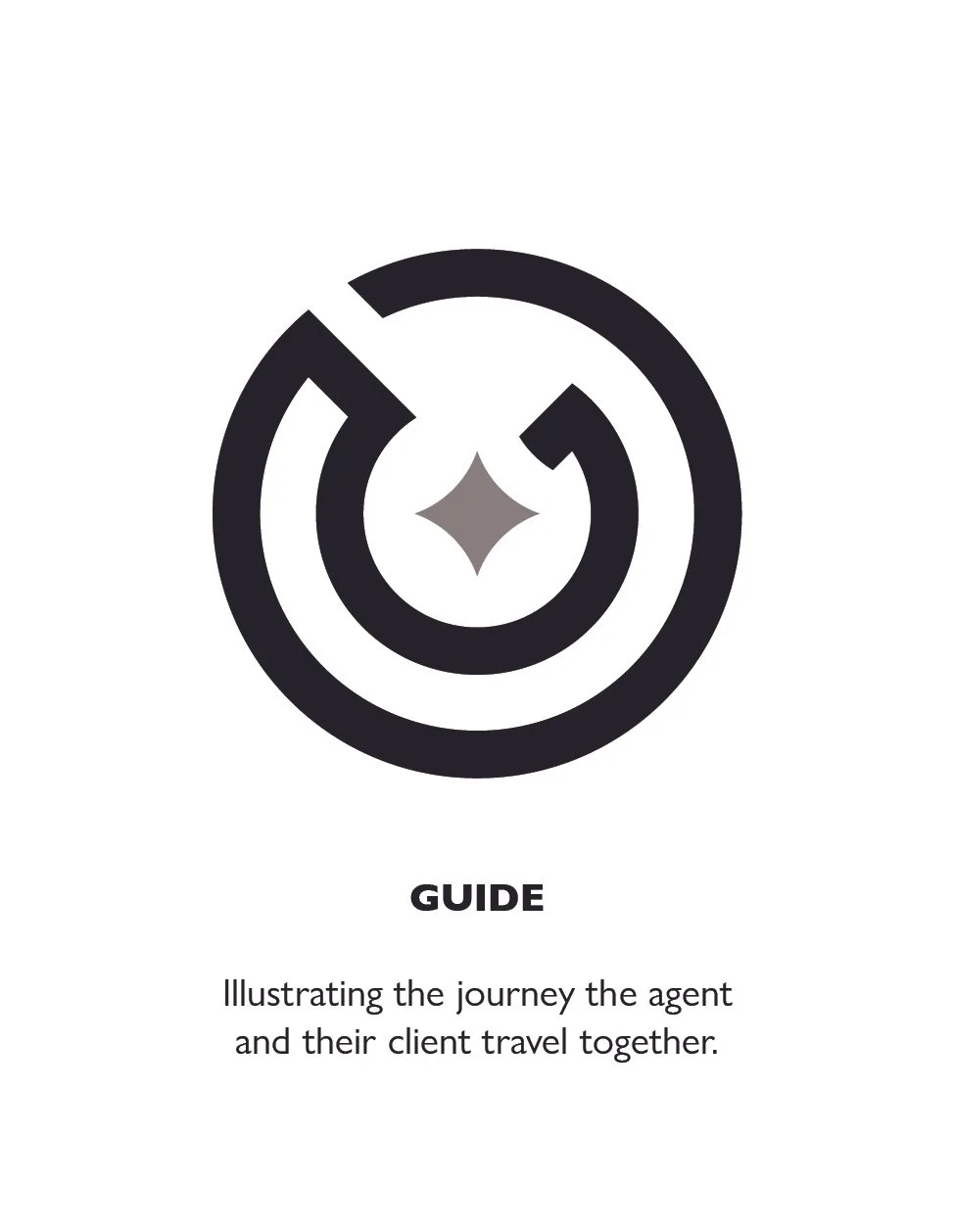
From the very beginning of this design process we wanted to focus on the mission of Oracle Group being your guide through the home buying and selling process.
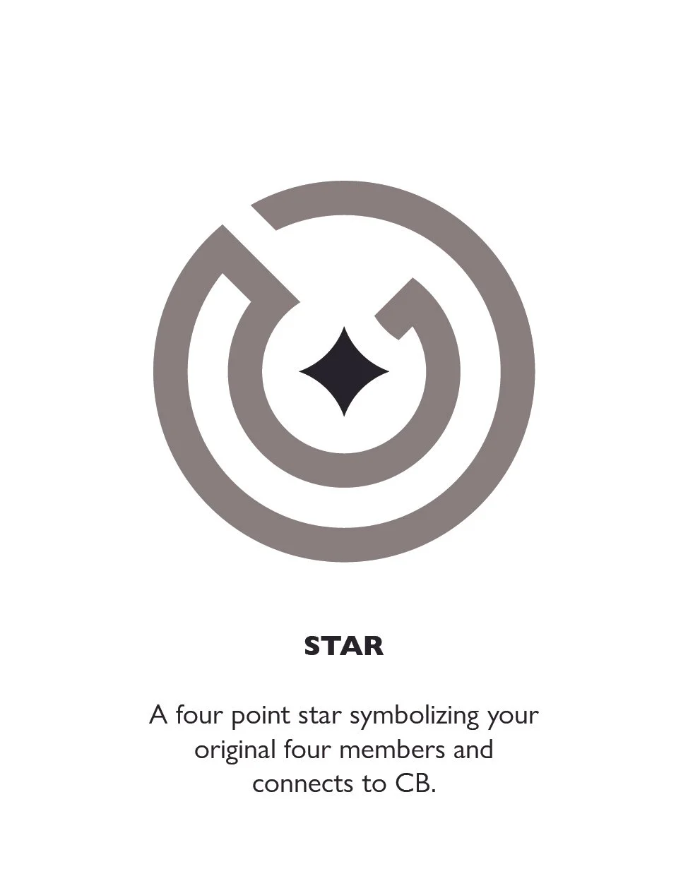
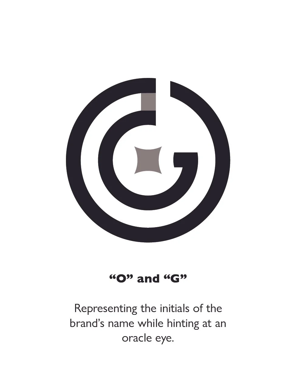
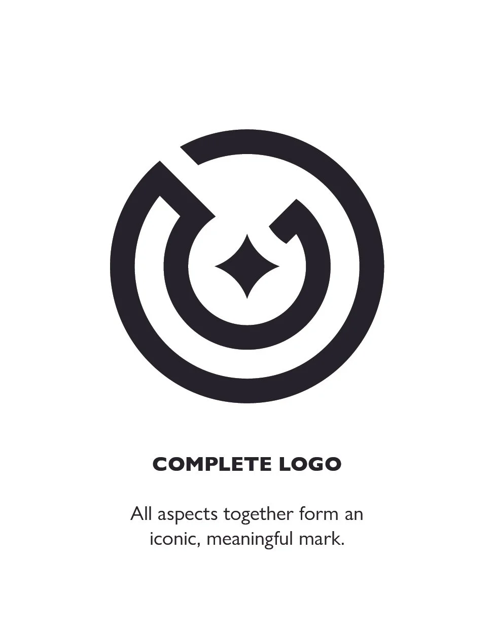
The design pulls from a modern take on traditional oracle iconography while incorporating the brands “O” and “G” into the design.
The design philosophy here splits the difference between a friendly hometown feel and a modern professional design.

The logo Suite
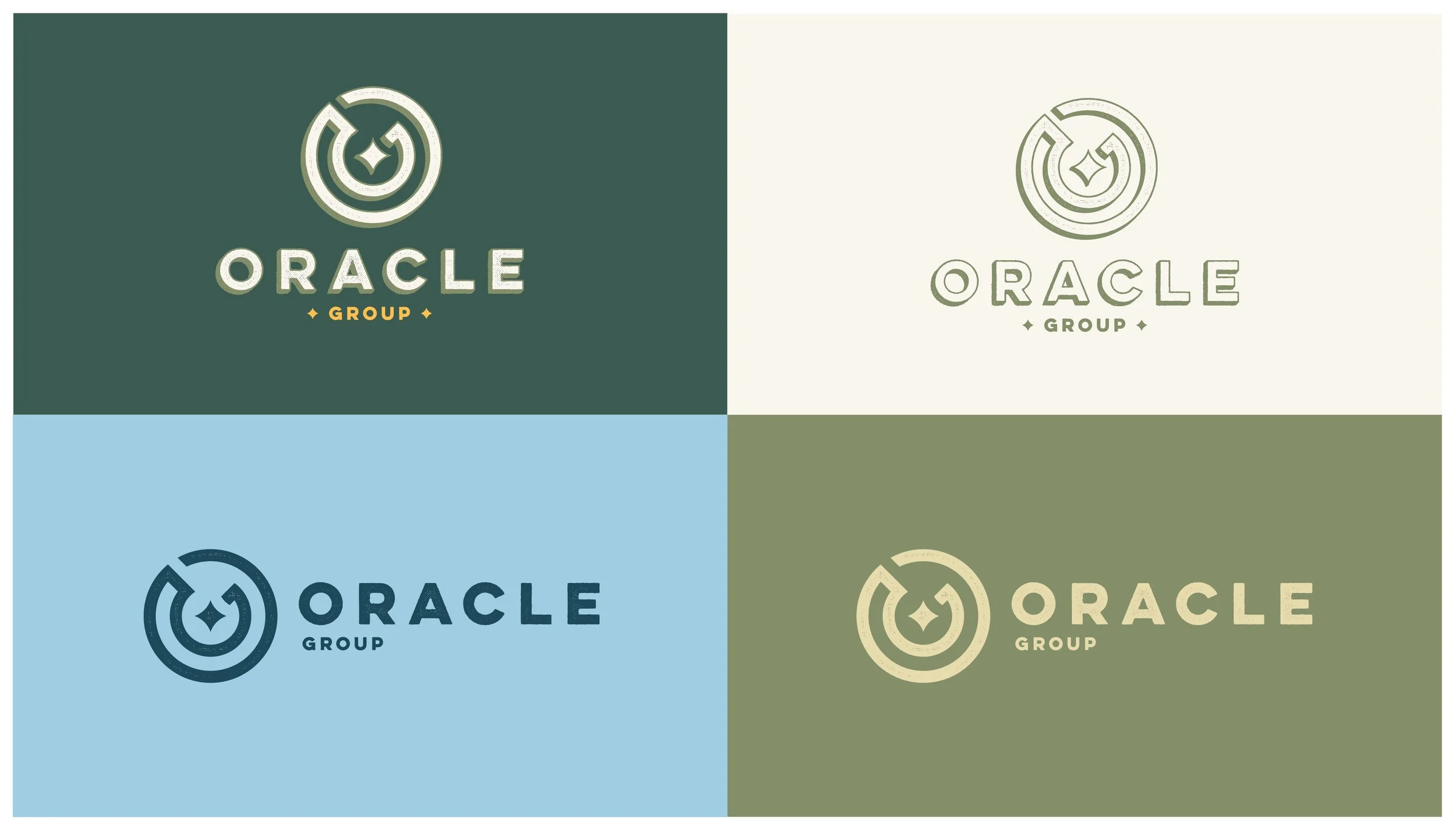
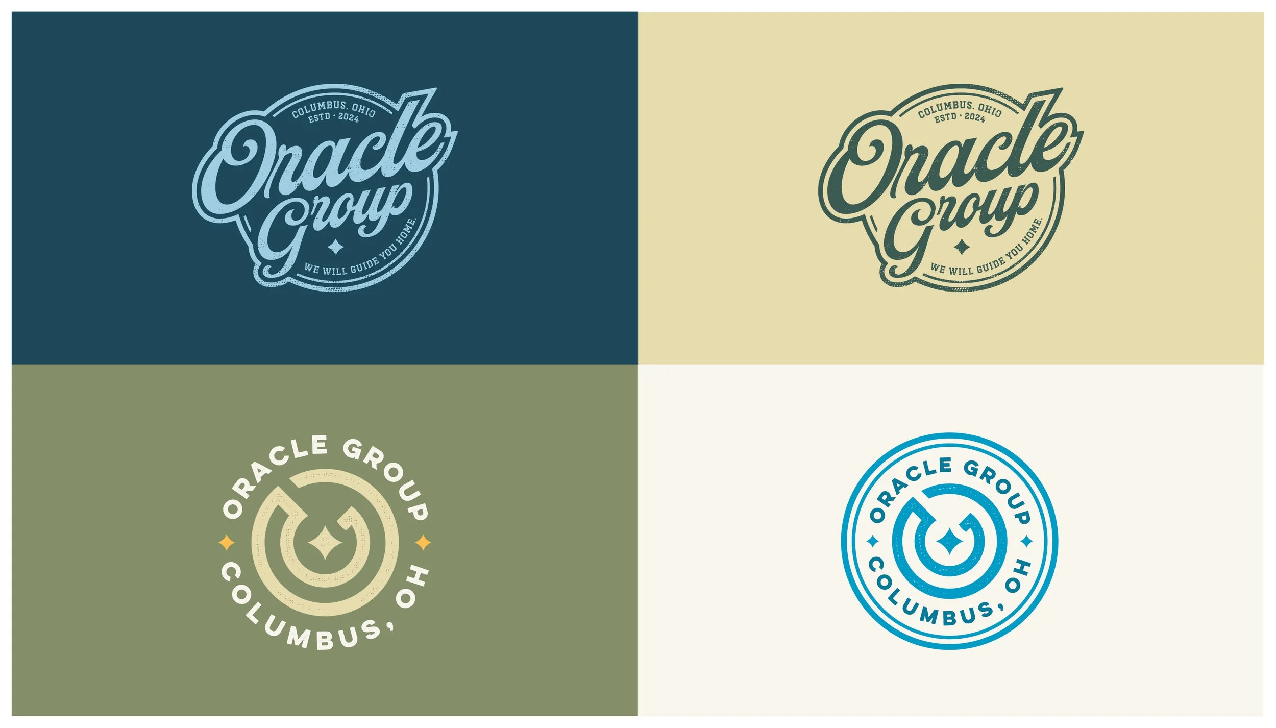
We designed this logo suite to have flexibility with various versions of the logo mark and accompanying logo badges. I wanted the design to be able to transition seamlessly between the more professional aspects of real estate while still leaning into a more heritage feel whenever client facing.
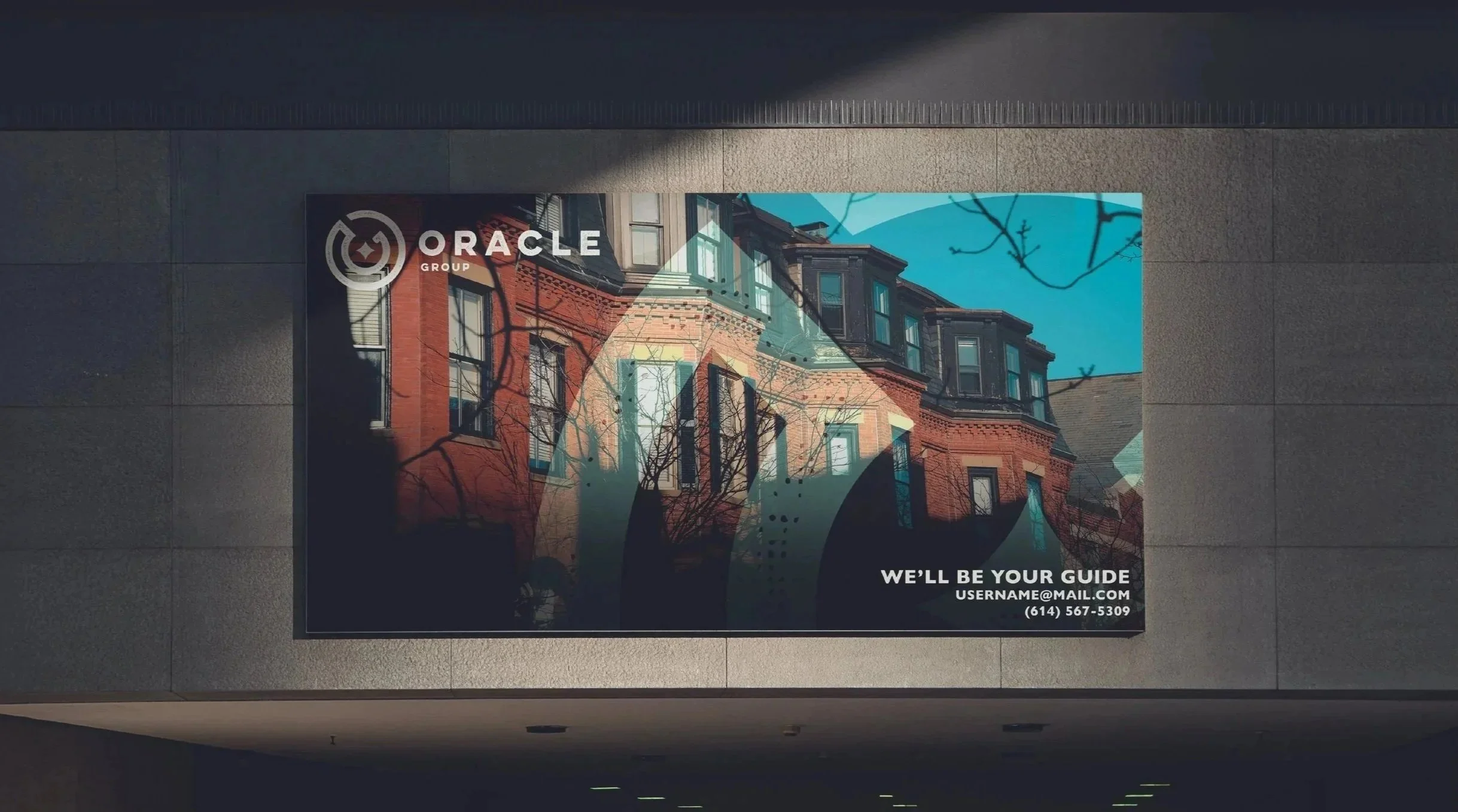
We expect the brand to be showcased on a wide variety of print media including apparel, stationary and signage so the design needed to function at any size.
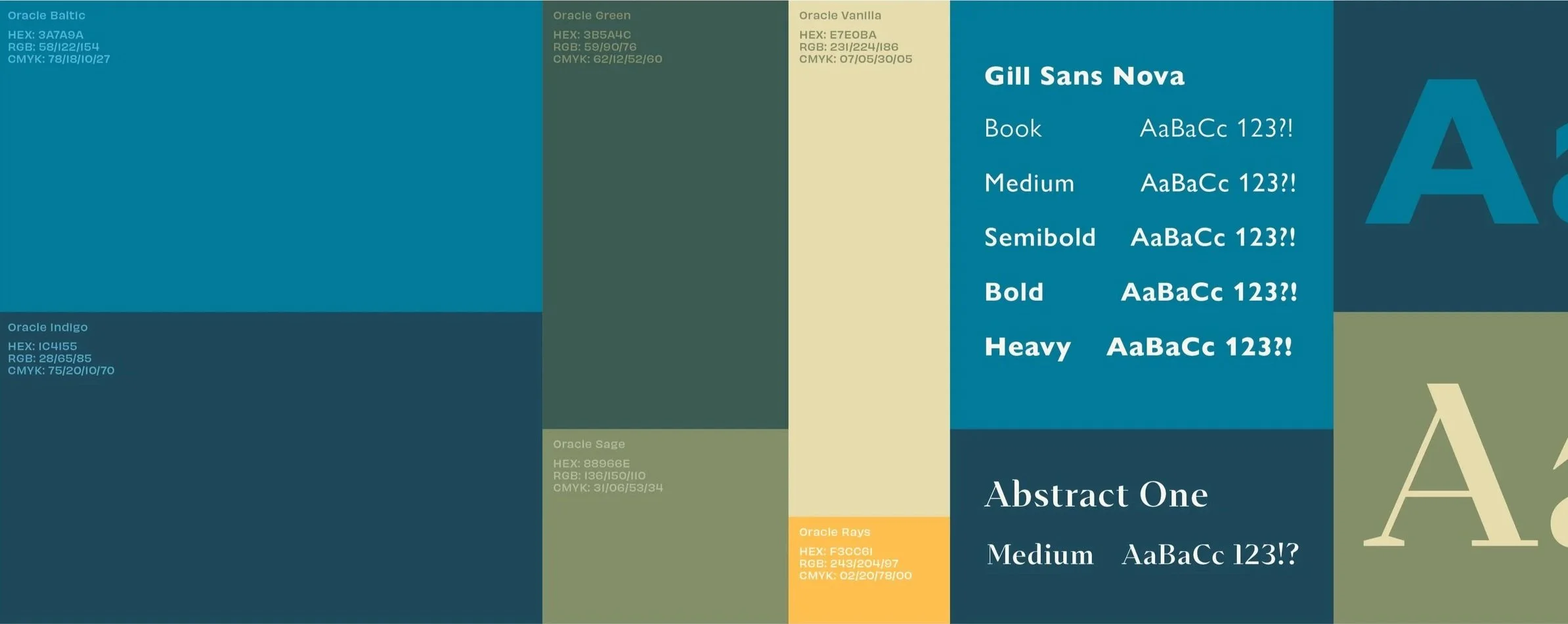

Color, typography and Patterns
Gill Sans Nova felt like the perfect primary font here. It feels professional with a slight lean towards playful and light-hearted. This pairs perfectly with how the clients wants the company to be perceived. We paired this font with a secondary, modern serif font that gives a sophisticated feel to the body copy and secondary sub headers.
Color proved to be a rewarding challenge. Oracle Group is a group under the umbrella of the real estate company Coldwell Banker. This brand needed to fit snuggly into Coldwell’s brand identity which is dominated by blues and grays. So for Oracle Group we developed a palette that incorporates blues to match but also introduces a warm, friendly collection of greens, tans and yellows to differentiate the brand whenever possible.
Patterns were created from the shape language found in the main brand logo. Giving the brand options with pattern designs is crucial considering how often the brand is showcased on printed material. Regardless of if its a hat, yard signage, or stationary, these patterns add a bit of character and cohesiveness to the brand overall.